What you'll learn - Switch period (week / month / year / all-time). - Read AI coach cards and stat charts, and understand what signals real improvement. - Read the comparison table's percentage changes, and know where to change your weekly goal.
1. Where to open
Bottom tab Analysis.
Use the top segment buttons (or re-tap the tab) to cycle week → month → year → all-time. A one-time hint toast shows you this shortcut the first time.
Weekly, monthly, and yearly views share almost the same chart layout — only the comparison baseline (last week / last month / last year) and the data granularity change. So below, we walk through each chart in detail for the weekly view, then only call out what's different for monthly, yearly, and all-time.
2. Weekly
2.1 Persona, AI coach, comparison table
At the top: this week's persona summary and the AI Coach card. Tap the coach card to open a sheet that spells out each tip in more detail.
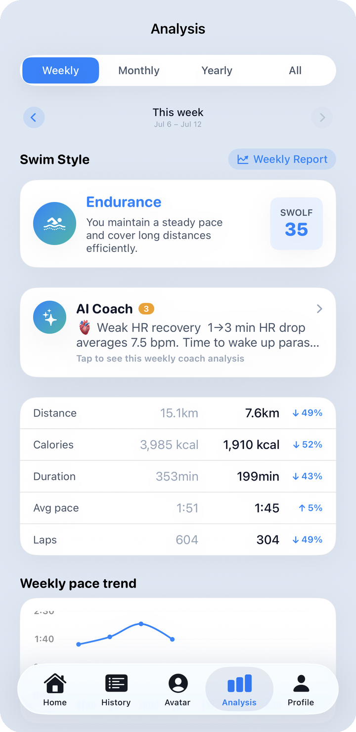
What to look at here: AI Coach doesn't analyze a single session — it pulls together all the data for whatever period you're currently viewing (week/month/year/all-time) into up to 3 coaching tips. The insight in Post-workout summary, which appears the moment you finish a swim, only looks at that one session, so the two serve different purposes.
| AI Coach (Analysis tab) | Post-workout summary (Home) | |
|---|---|---|
| What it analyzes | The whole period you're viewing (week/month/year/all-time) | The single session you just finished |
| When to check it | When you want to look back at your recent trend | Right after you finish swimming |
| Where it lives | AI Coach card on the Analysis tab | Post-workout summary card on the Home tab |
Right below is the comparison table, which lines this week up against last week. Each of its five rows — distance, calories, workout duration, average pace, lap count — shows the previous value (light gray), the current value (bold), and a ±N% change with an arrow. Here's how to read it.
| Metric | Good sign |
|---|---|
| Distance · Calories · Lap count | Positive (▲) — more is better |
| Average pace · Duration | Negative (▼) — shorter is better |
For example, -3% on average pace means you covered 100m 3% faster than last week; +15% on duration means you swam 15% longer than last week.
2.2 Pace/distance trend, goal, SWOLF
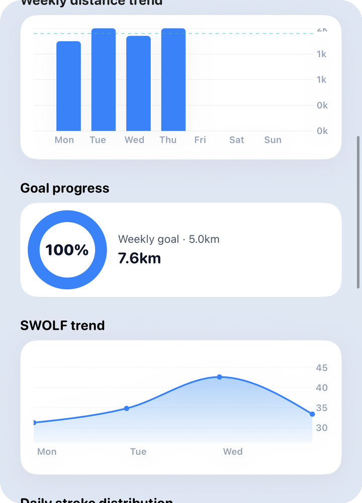
What to look at here: Pace is how long it takes to cover 100m. If the pace trend line drops, you're covering the same distance faster; if the distance trend rises, your training volume is going up. Further down the same screen come the goal ring (this week's progress against your weekly goal) and the SWOLF trend chart. SWOLF adds a lap's time and stroke count into one efficiency score — a downward trend means you're covering the same distance with fewer strokes and less effort, i.e. your efficiency is improving.
2.3 Stroke mix by day, HR zones, max HR
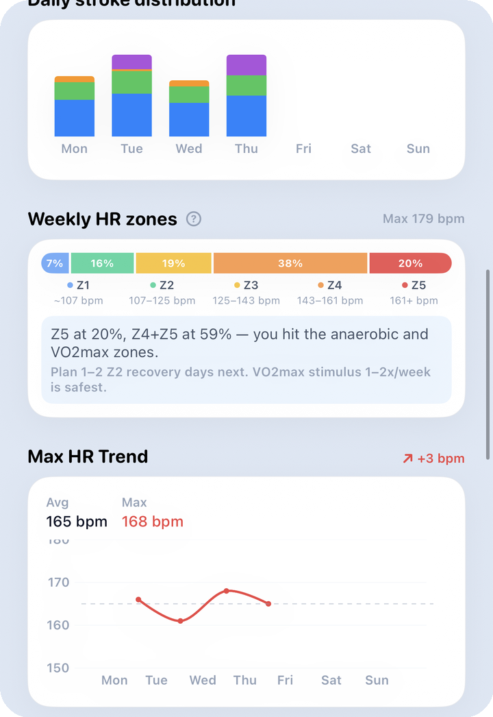
What to look at here: The stacked bar shows which stroke you swam how much on which day of the week. HR zones split intensity into five bands based on your max heart rate.
| Zone | % of max HR | Meaning |
|---|---|---|
| Z1 | 50–60% | Recovery / warm-up |
| Z2 | 60–70% | Aerobic base / fat burn |
| Z3 | 70–80% | Aerobic (endurance) |
| Z4 | 80–90% | Lactate threshold / tempo |
| Z5 | 90%+ | Maximum / anaerobic |
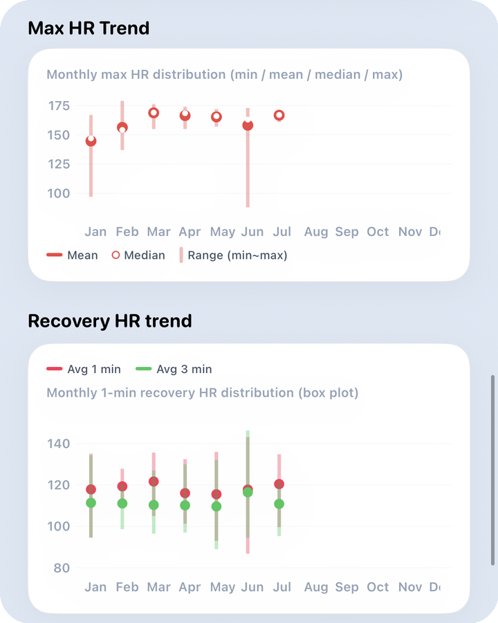
The zone distribution bar tells you how much time you spent at the intensity you were aiming for (Z2–Z3 for endurance work, for example). The max HR trend links up the highest heart rate reached in each session.
2.4 Recovery HR, stroke distribution
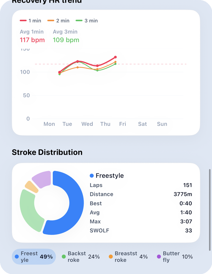
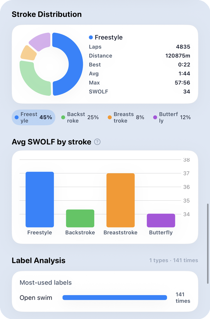
What to look at here: Recovery HR measures how fast your heart rate drops after you finish swimming — if this trend line climbs (meaning it's dropping more), your cardiovascular recovery is improving. The stroke distribution donut shows the proportion of each stroke you mixed in this week.
2.5 SWOLF by stroke, labels, lesson vs. free swim
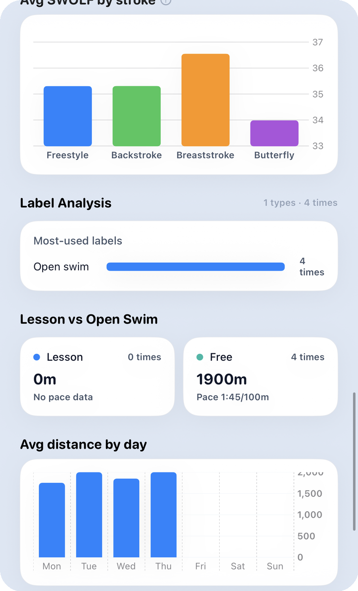
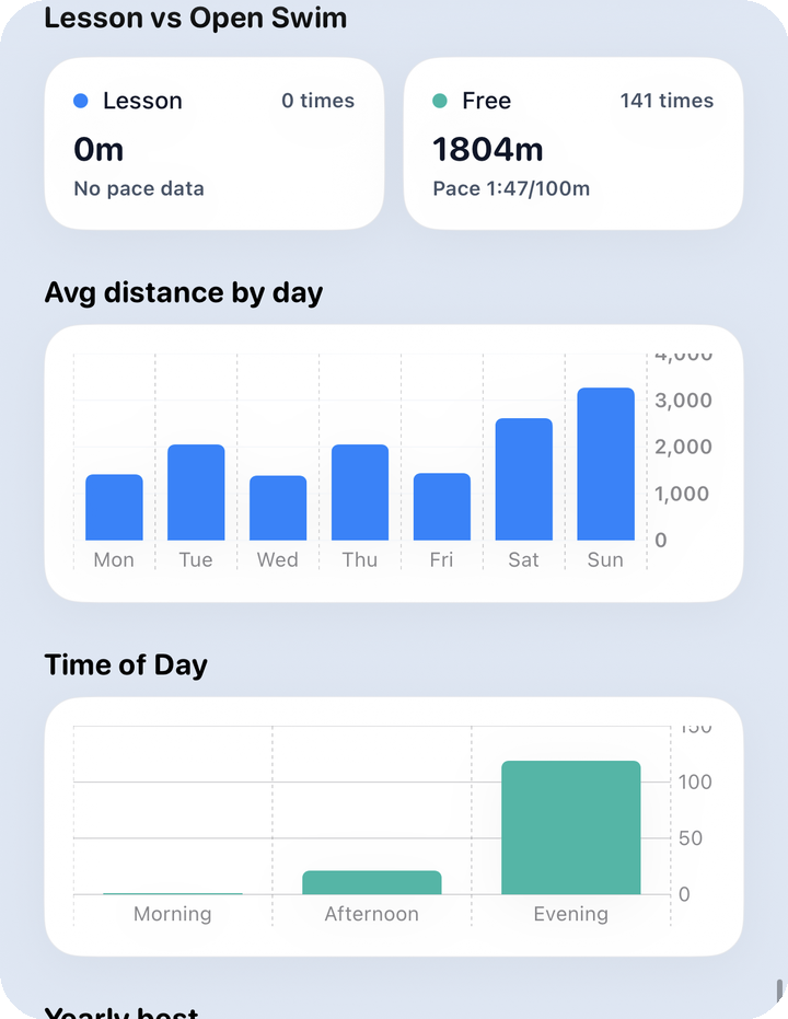
What to look at here: The SWOLF-by-stroke bars point out which stroke is specifically less efficient for you — lower means that stroke feels easier. Label analysis shows how much of each label (interval, drill, warm-up, etc.) you tagged in History this week, and lesson vs. free swim compares the split between the two.
2.6 By weekday, time of day, weekly bests, summary stats
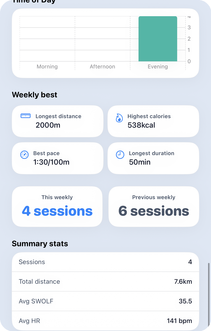
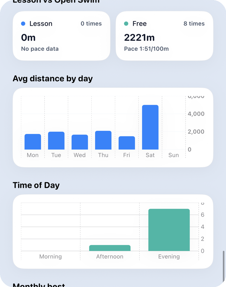
What to look at here: Average distance by weekday tells you which day you swam the most or least, and time-of-day distribution shows when you tend to swim. The weekly bests card gathers this week's top records, and the summary stats card at the very bottom wraps up the weekly view.
HR zone definitions match Home → Home · HR zones
3. Monthly
The same order (persona · AI coach · comparison table → pace · distance · goal · SWOLF → stroke mix · HR zones · max HR → recovery HR · stroke distribution → SWOLF by stroke · labels · lesson vs. free → weekday · time of day · bests · summary) repeats at month scale. Here's what changes:
- The comparison table's baseline shifts from last week to last month.
- The goal ring's target becomes 4× your weekly goal.
- Some charts, like max HR and recovery HR, switch from a daily point to a box plot summarizing that month's high-to-low spread in one shot. The whole box shifting down means the period overall is improving.
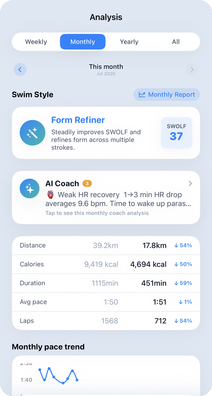
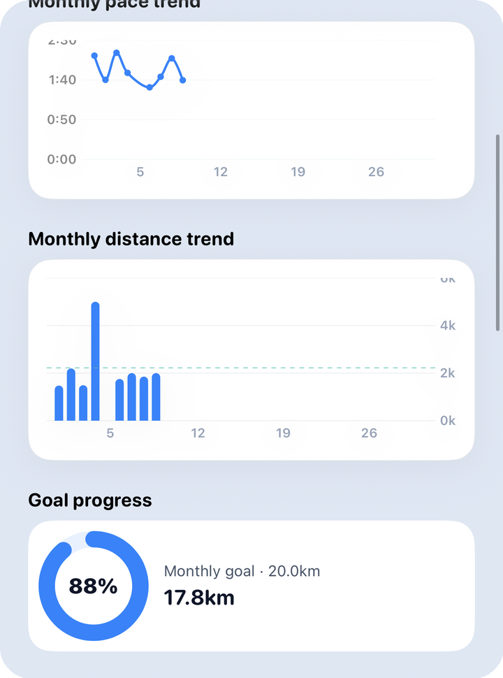
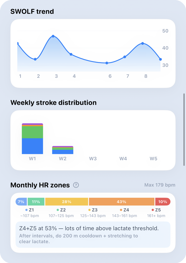
What to look at here: The pace, distance, goal, SWOLF, and HR zone reading described in 2.2–2.3 above applies exactly the same way. With a full month of data, though, more charts break down by week (week 1–5) rather than by weekday.
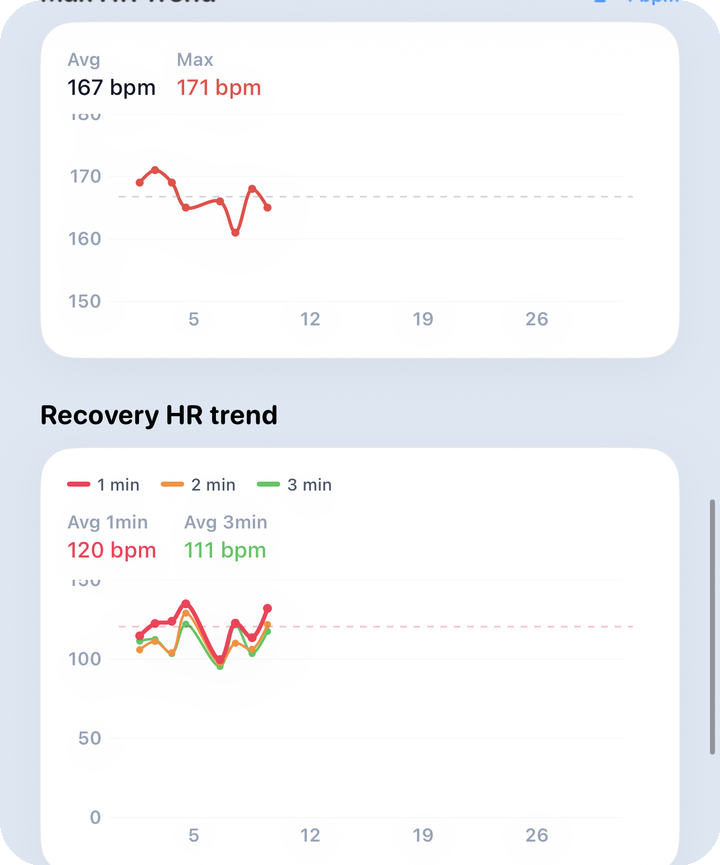
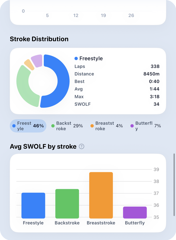
What to look at here: SWOLF-by-stroke and stroke distribution show which stroke you swam more comfortably and more often this month, while label analysis and lesson vs. free swim summarize the character of this month's training.
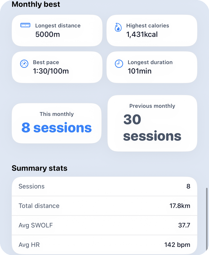
What to look at here: Average distance by weekday and time-of-day distribution reveal this month's swim habits, the monthly bests card holds this month's top records, and the summary stats card wraps up the monthly view.
4. Yearly · all-time
Yearly and all-time scroll through the same story. The comparison baseline for yearly is last year, and the goal ring targets 52× your weekly goal. The all-time period drops the comparison table and goal ring entirely, replacing them with a card for total distance accumulated to date. (Some captures are EN-only screens — KO skips missing images.)
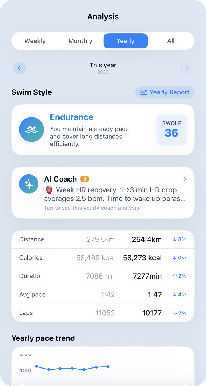
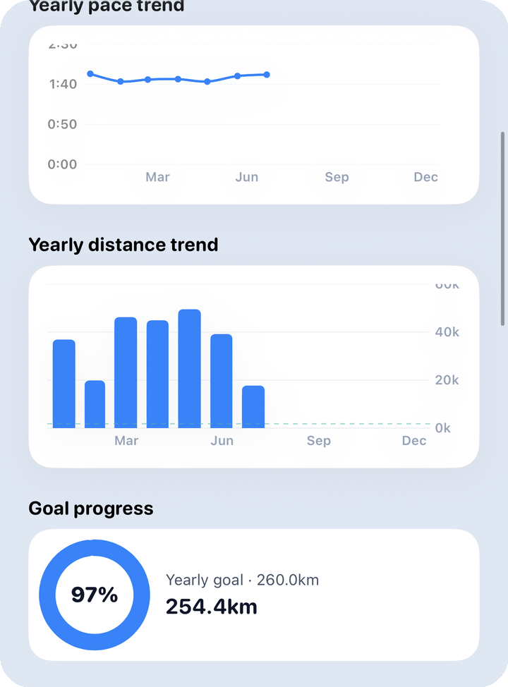
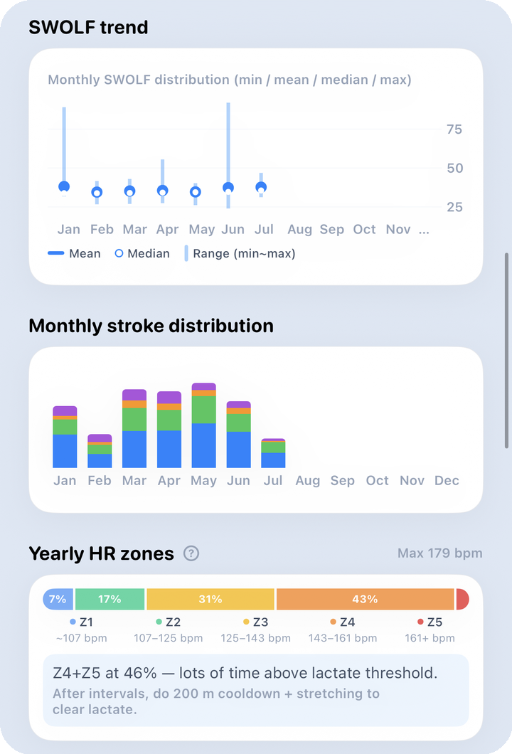
What to look at here: At the yearly scale, the big multi-month arc matters more than any single week's ups and downs. The key question for the pace/distance box plots is whether they drift down (faster) or up (farther) over time.
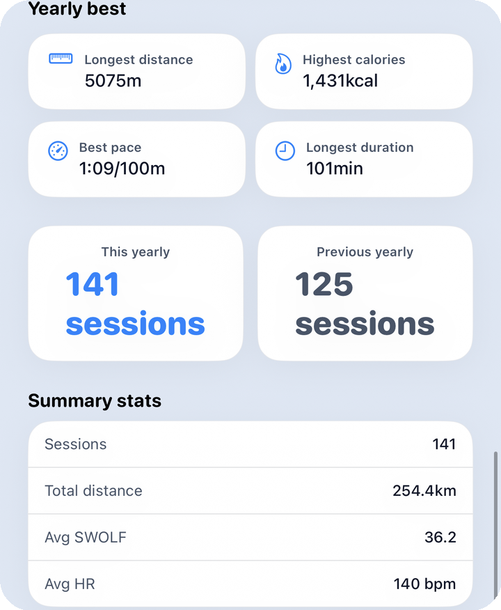
What to look at here: The volume/season pattern chart shows which months you swam more or less, and the summary at the bottom of the all-time screen totals everything you've logged so far.
5. Reports
Tap the chip button next to the Persona section to open a report. Its label changes to match whatever period you're viewing — "This week's report" / "This month's report" / "This year's report" — and it opens exactly that period. The Report button on the History tab, by contrast, is always fixed to monthly — if you want to show off this week specifically, open it from here with Weekly selected instead.
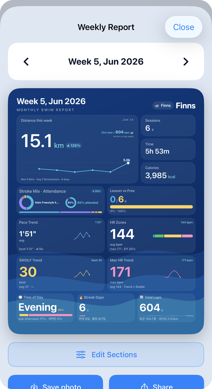
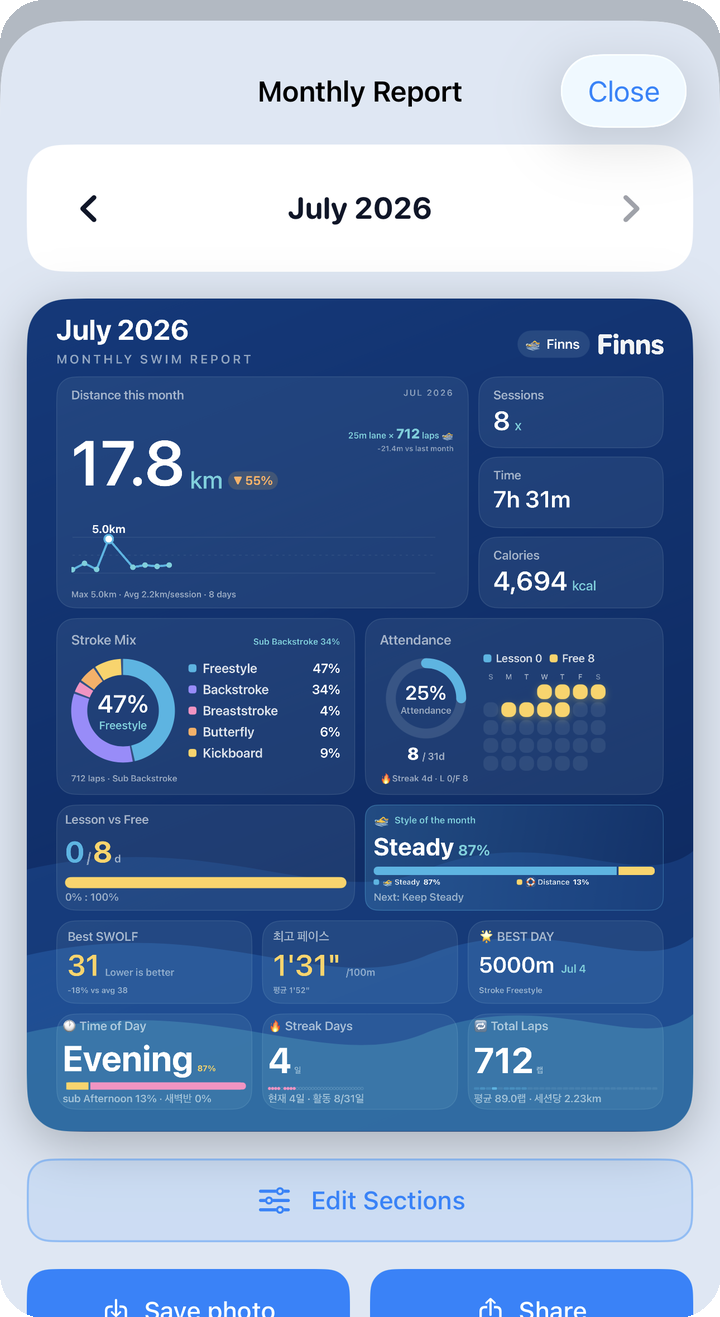
What to look at here: The report card for whatever period you chose is calculated on the spot. For card layout, section editing, and saving/sharing, see Share.
6. Changing your weekly goal
What fills the goal ring is set in the "Weekly goals" section under Profile → Edit — not in the Analysis tab. The default when you sign up is 5km a week, and you can enter distance (km), calories, and weekly session count. Only the distance goal feeds the ring calculation, though — weekly uses that value as-is, monthly uses 4×, and yearly uses 52× as the target for progress.
Find the profile edit screen at Profile.
7. Worth remembering the first time
- AI Coach looks at "the whole period"; Home's post-workout summary looks at "the one session you just finished." Check both and you'll miss less.
- In the comparison table, ▲ is the good sign for distance, calories, and lap count; ▼ is the good sign for pace and duration.
- Lower pace and lower SWOLF mean you're improving; a recovery HR trend climbing (dropping more) also means you're improving.
- If the goal ring isn't filling up, check your weekly goal under Profile → Edit, not the Analysis tab.