What you'll learn - Read the top persona banner and the four metrics. - Scrub and pinch the 5-channel multi-chart, and know what each channel shows. - Open the HR-zone bar and its help sheet to see zone boundaries and how MaxHR is derived. - Jump into the post-workout AI summary and the share screen.
1. Where to open
Bottom tab Home — the first screen you see when you launch the app.
2. Screen layout
Home is designed to need almost no scrolling. Top to bottom: persona banner → 4 metrics → today's session (multi-chart) → HR zones. If this is a first run with no watch data yet, the screen may be filled with sample data.
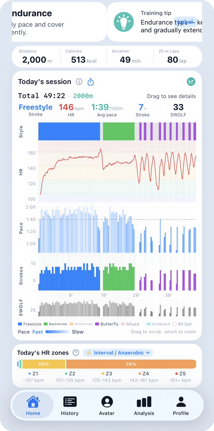
What to look for here: from top to bottom you can see the persona banner, the four Distance/Calories/Duration/Laps metrics, today's 5-channel multi-chart, and the HR-zone bar at the very bottom — the entire Home layout in one shot. The next sections zoom into each area in order.
2.1 Persona banner · metrics
When there's a focused (most recent) workout, the top area is a 3-page banner that auto-advances every 5 seconds: ① today's swim persona (e.g. Endurance) ② a training tip for that persona ③ a one-line session verdict. You can also swipe through it manually. To the right, a streak counter (🔥, consecutive days) and a Label button float independently of the banner and stay tappable at all times.
- Label: re-tag this session as a lesson, free swim, etc.
- Persona is recalculated on the fly from your recent pattern every time you open the screen — it isn't a value you lock in once and keep. There's no settings toggle to pin a persona.
Here's the full set of personas the app recognizes. If nothing stands out strongly, you'll see "All-Rounder."
| Persona | Rough criteria |
|---|---|
| 🌊 Endurance | Average distance 1,200m+ |
| ⚡️ Sprinter | Short distance (under 800m) + fast pace |
| 🎯 Technician | Consistently low SWOLF |
| 💪 Power Stroker | High efficiency per lap (distance / lap count) |
| ⚖️ All-Rounder | No single trait stands out |
| 🚢 Long-Distance Cruiser | Long distance + very stable pace |
| 🏗️ Endurance Builder | Distance trending upward over time |
| 🔁 Interval Racer | Short rests + many laps |
| 🔬 Form Refiner | SWOLF trending down (improving) |
| 🌈 Multi-Stroke Master | Balanced use of all four strokes |
| 🏊♂️ Freestyle Specialist | Freestyle is the dominant stroke |
| 🕐 Steady Pacer | Very low pace variability |
| 😊 Casual Swimmer | Occasional, shorter sessions |
Below the banner, four metric pills show, in order, Distance · Calories · Duration · Laps for today's (or the focused) session. Distance tells you how far you went, calories your energy burn, duration the session length, and lap count how it was structured into sets.
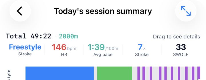
What to look for here: the persona name with its short description, the Label button on the right, and the four metric numbers below it. If the label doesn't match the actual workout type (lesson vs. free swim), you can fix it right from this screen.
2.2 Five-channel multi-chart
Style · HR · Pace · Strokes · SWOLF stack vertically on one shared time axis. What each channel shows:
- Style: consecutive laps of the same stroke are merged into a color band. Rest shows as a gray band; a 4-lap IM set (fly → back → breast → free) gets its own red outline on top.
- HR: the heart-rate line sits over pastel Z1–Z5 zone bands (see 2.3 below), so you can see at a glance which intensity zone you were in.
- Pace (100m per lap, in time): drawn as one bar per lap — the fastest lap is dark blue, the slowest is light blue. A gray dashed line marks the session average. Bars getting shorter overall means you got faster.
- Strokes: total stroke count per lap as bars, with distance markers (e.g. 100m, 200m). This is the only one of the five channels that shows elapsed time on the X-axis — use it as your time reference when reading the others.
- SWOLF (stroke count + time in seconds for a lap — lower means more efficient): drawn as grayscale bars per lap; darker gray means better efficiency, lighter gray means worse. If your pace held steady but SWOLF dropped, your stroke got more efficient.
For open-water swims, there's no lap data, so these five channels are replaced by Map · HR · Pace (3 channels).
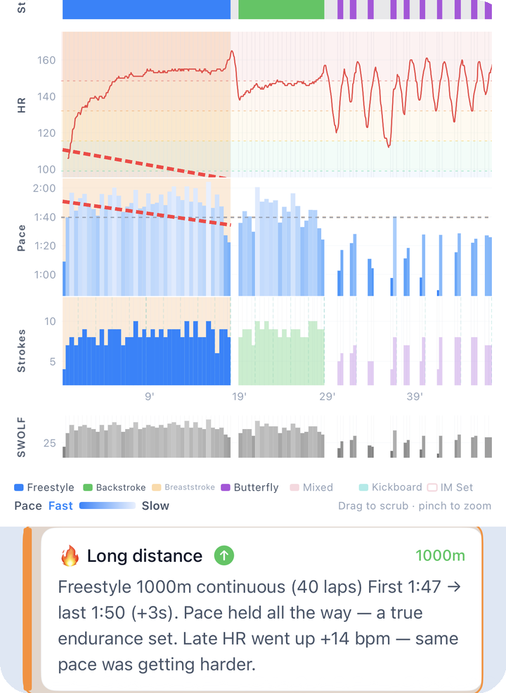
What to look for here: all five channels stacked and aligned, plus the crosshair that appears when you drag across the chart. Faint vertical lines mark lap boundaries, which makes it easy to eyeball where each set starts and ends.
Controls: - One-finger short drag or tap: see all five values at that moment via a crosshair (scrubbing) - Pinch: zoom in/out (always anchored to the center), and one-finger drag pans while zoomed - Double tap: clear the selection and reset zoom - ?: how to read the graph — opens explanations for Style, HR, Pace, Strokes, and SWOLF.
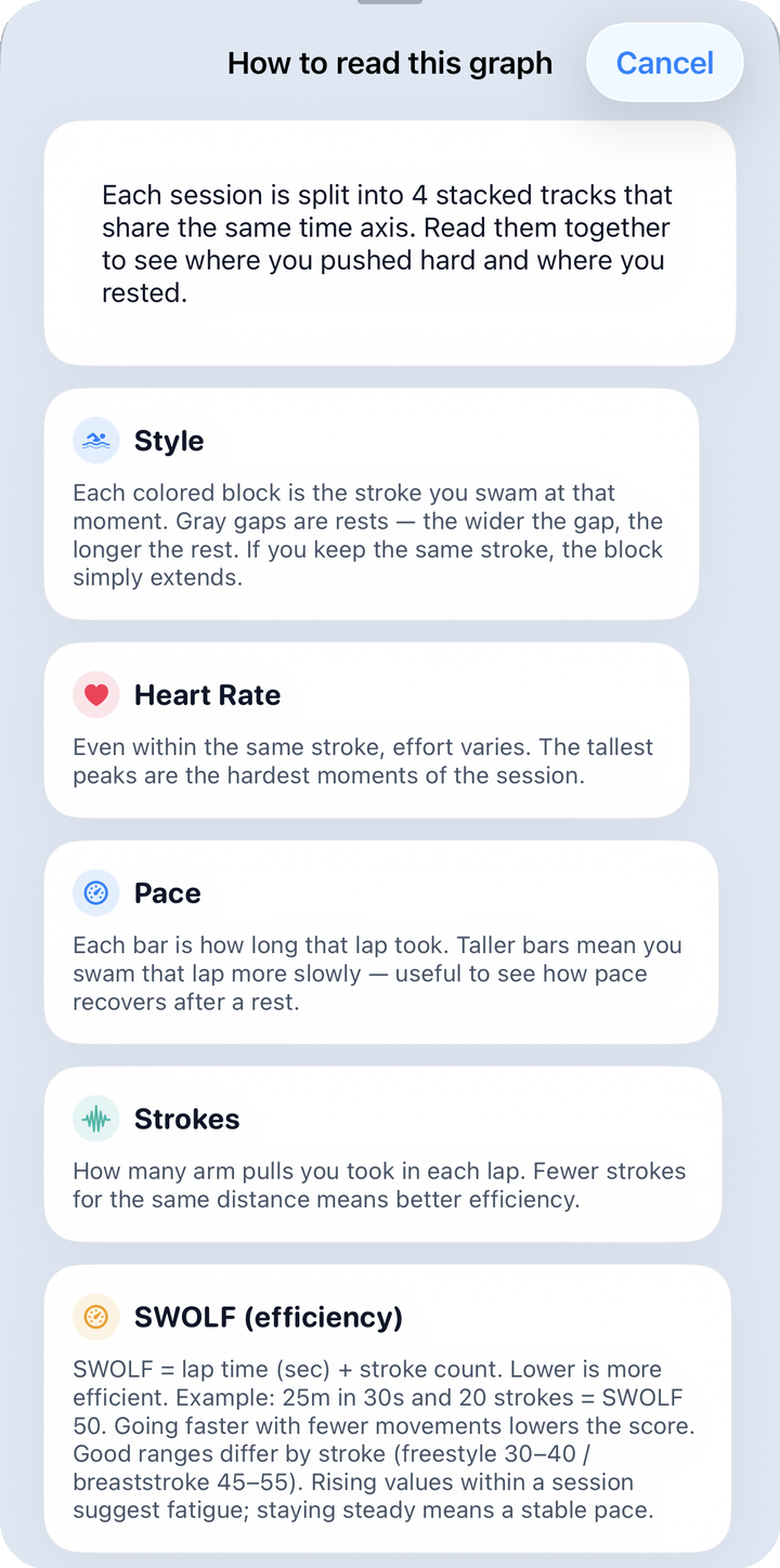
What to look for here: a set of cards walking through each of the five channels in order. If this is your first time seeing the multi-chart, it's worth reading this help sheet before diving in.
2.3 Heart-rate zones
HR zones (your training intensity split into Z1–Z5 relative to max heart rate) show as a bar matching the session type. Any zone with a nonzero share appears, and tapping the coach-comment badge next to the title expands a short note. Seeing which zones you spent time in tells you whether today leaned toward recovery or high-intensity intervals.
| Zone | Boundary (%MaxHR) | Meaning |
|---|---|---|
| Z1 | 50–60% | Recovery / Warm-up |
| Z2 | 60–70% | Aerobic base / Fat burn |
| Z3 | 70–80% | Aerobic (endurance) |
| Z4 | 80–90% | Lactate threshold / Tempo |
| Z5 | 90%+ | Maximum / Anaerobic |
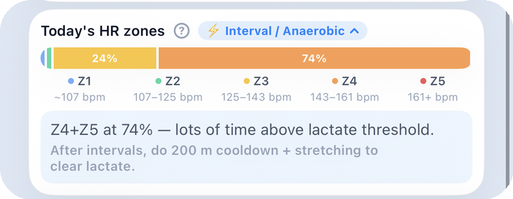
What to look for here: each zone's share shown as bar length (or a percentage), with a one- or two-sentence coach comment underneath summarizing today's intensity profile.
Tap ? to open a sheet with zone definitions, how they're calculated, and sources (AHA, ACSM, CDC, etc.).
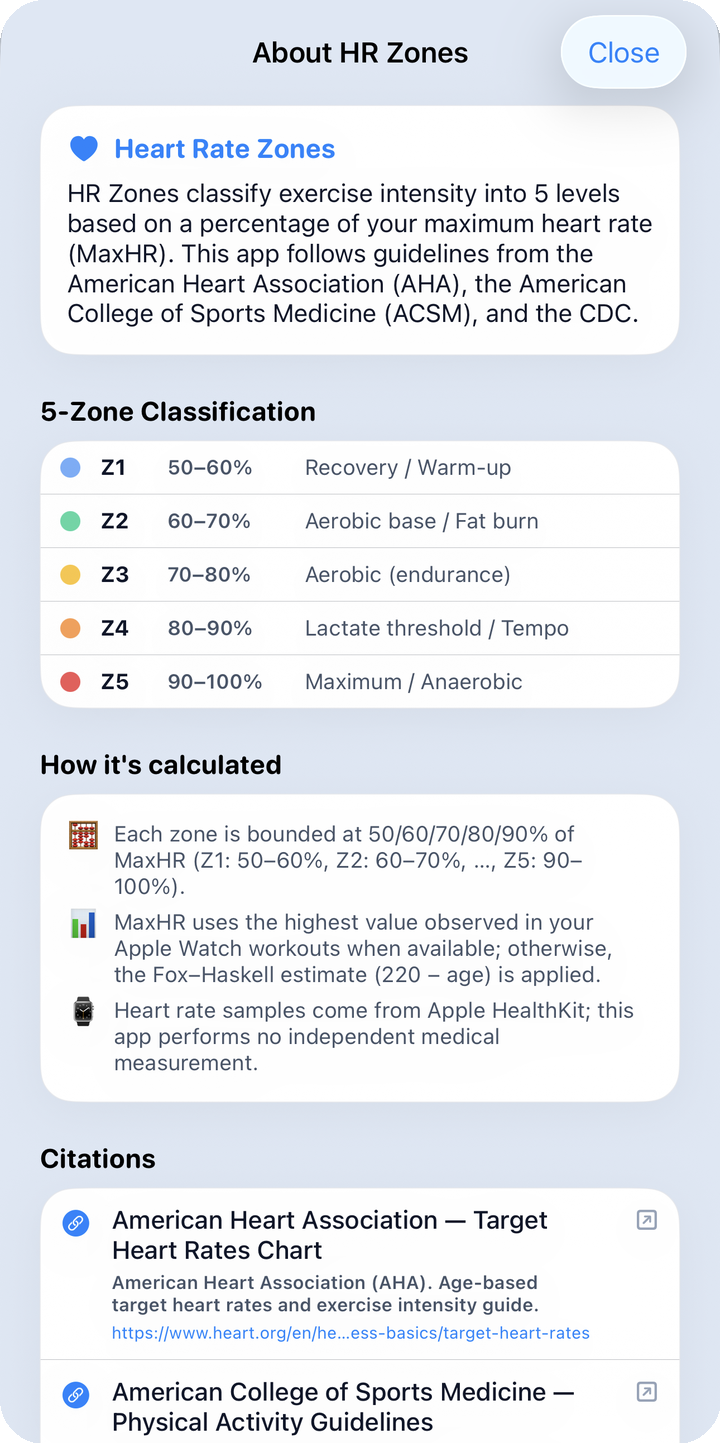
What to look for here: the sheet scrolls through an overview, the 5-zone table, the calculation method, and cited sources in order. If HR zones are new to you, this is the place to get the definitions straight before reading them elsewhere.
- MaxHR prefers the highest heart rate actually observed on your watch. The in-app help also mentions an age-based estimate for when there isn't enough data yet.
- This is a training reference built from HealthKit values, not a medical measurement.
2.4 Share · post-workout summary
Two icons on the session card header: - Share (paper plane) → export a session video → Share - AI coach (chart icon) → analyze this session right away and open the Post-workout summary
When a new workout comes in, a one-time "View today's swim summary" alert appears; confirming it takes you to the same post-workout summary screen.
2.5 No watch data yet?
If the session you're seeing looks unfamiliar, it may be sample data. The app only fills Home with sample sessions from the last 7 days when there are zero real workouts, and it switches to your own data automatically the moment a real one comes in. See the sample data section in Getting Started for details.
3. Common mistakes
- Wrong stroke type: fix the session-level label. (Per-lap editing isn't supported.)
- No workouts yet: depending on your HealthKit permission state, Home shows either "No session data" or a prompt to fix permissions.
- Manual entry without a watch is not supported.
- Persona looking off? It reflects your last few days of swimming — it isn't a fixed value, it's recalculated every time.
Next: Post-workout summary · History