What you'll learn - Open the AI briefing right after a session and understand the 75% chart : 25% cards split. - See what each card type tells you, and what it highlights on the chart when tapped. - Understand how the verdict is decided and what "baseline" means. - Know the on-device, rule-based limits.
1. Where to open
- AI coach icon on the Home session card
- View today's swim summary alert when a new workout arrives
- Same summary data from History → session detail
2. Screen layout
The screen splits top and bottom. By default, the top 75% is the multi-chart (the same 5-channel chart and scrubbing as Home, but with the title, help, and share icons hidden), and the bottom 25% is a scrollable card list. Tapping the expand button in the top-right grows the card area to fill the screen and hides the chart.
Tapping a card highlights the matching time range on the chart above in color — so a card isn't just text, it also points you to "where to look" on the chart.
(These captures are EN UI originals. KO builds skip missing language images.)
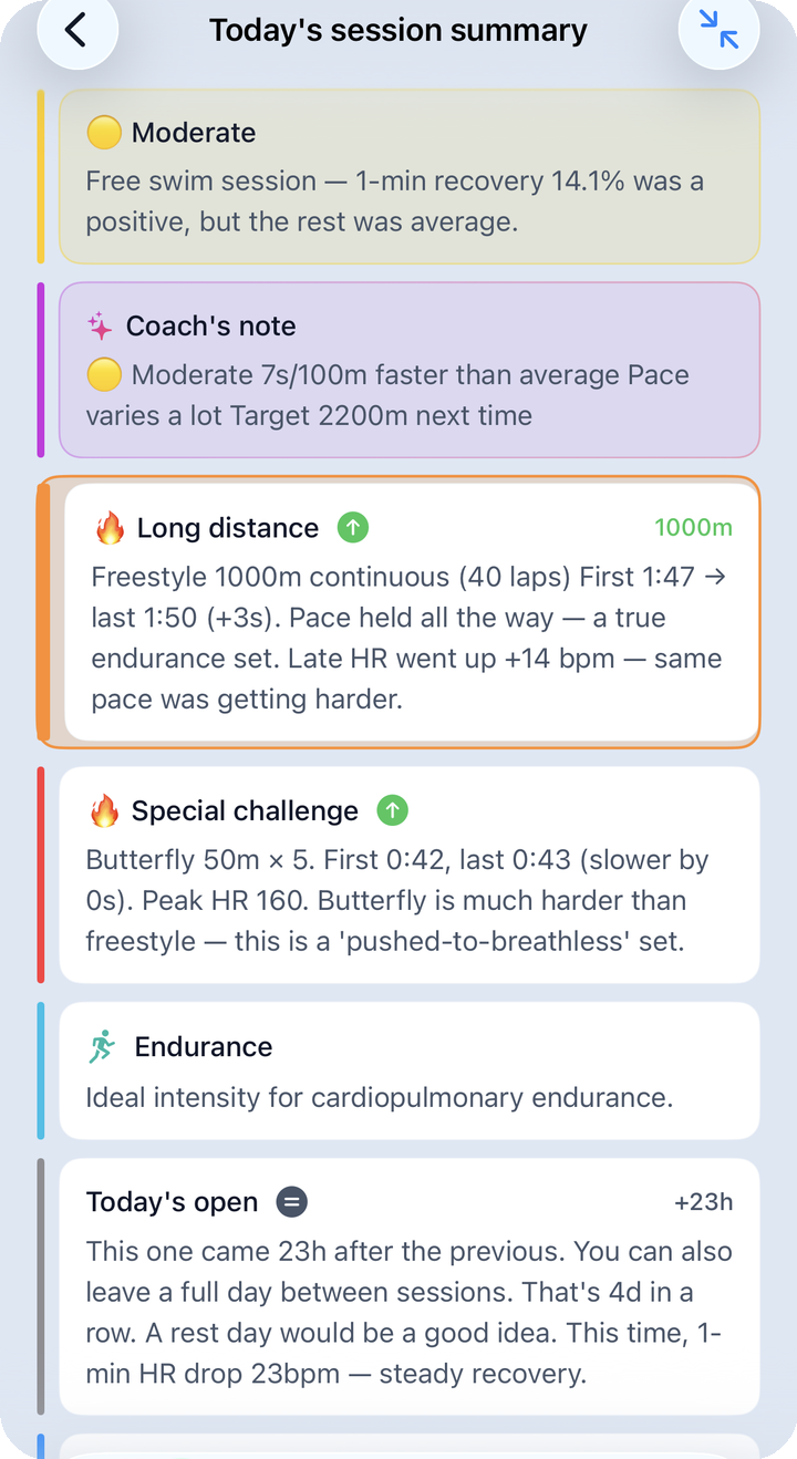
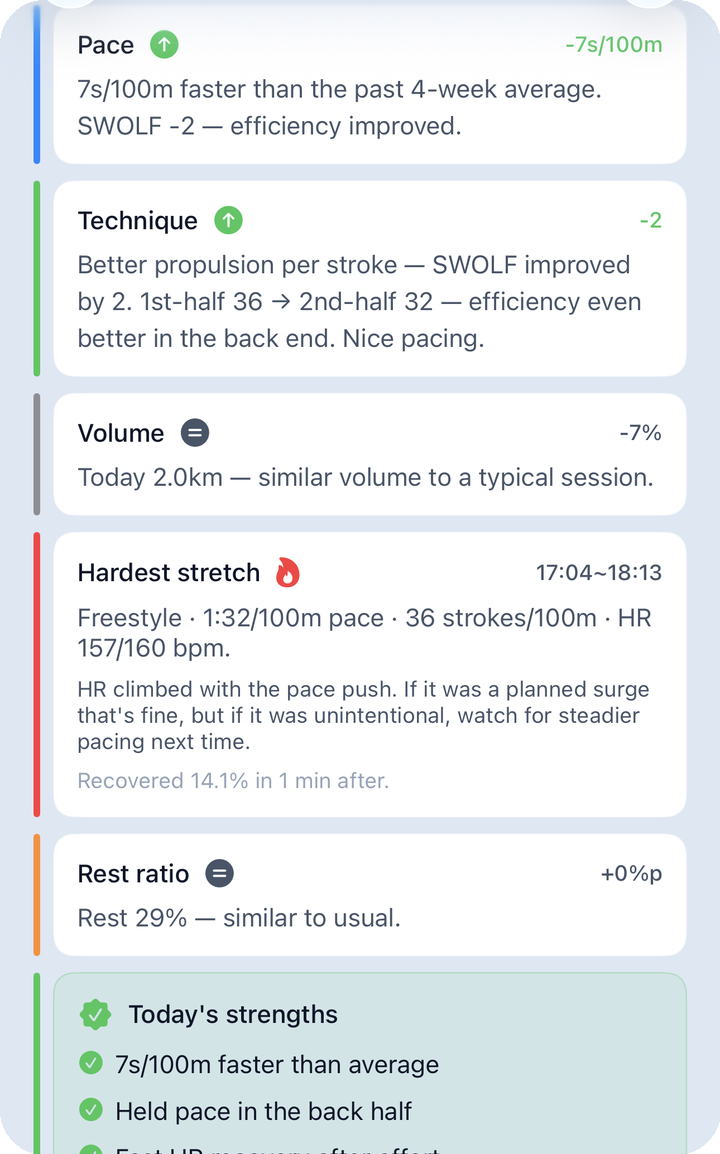
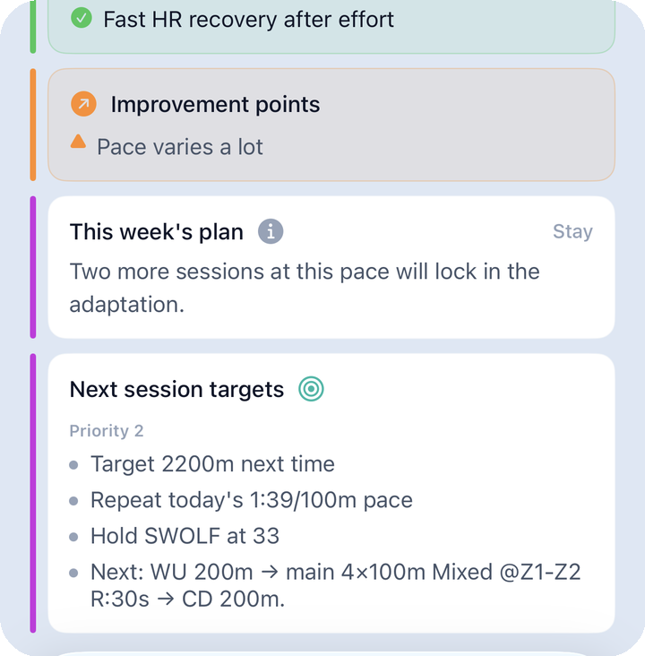
3. Card types
Counting every conditional card, there are up to 18 types, in this on-screen order. Pace, Technique, Volume, and This week's plan always appear; the rest only show up when their condition is met.
| Card (on-screen name) | What it tells you | What it highlights on the chart when tapped |
|---|---|---|
| Verdict (Solid session / Moderate / Overload / Restorative) | Overall session headline (🟢/🟡/🔴/🔵) + comment | Color matched to the verdict level |
| Coach's note | A short, friendly 1–2 sentence comment | Purple |
| Long distance | Special card when you swam further than usual | Orange |
| Special challenge | Flags a notably special session | Red |
| Purpose (e.g. Endurance) | Auto-classifies today's swim as speed / endurance / recovery / technique / mixed | Cyan |
| Today's open (session context) | How today relates to your previous session | Gray |
| Pace | Whether today's pace was faster or slower than your baseline | Blue |
| Technique (SWOLF-based) | Whether your SWOLF efficiency improved today | Green |
| Positive signal | What went well today (e.g. recovery) | Blue |
| Volume | Distance/volume, with a comparison chip like "2.1km +18%" in the top-right | Gray |
| Hardest stretch | Pace/stroke/HR summary of the toughest part + why it was hard | Red |
| 🚨 Risk signal | Only appears when the verdict is "Overload"; recommends 24–48h of recovery | Red |
| Rest ratio | A comment about your rest pattern | Orange |
| Today's strengths | Up to 3 bullets | Green |
| Improvement points | Up to 3 bullets | Orange |
| Personal best | Up to 3 🏆/⭐ bullets | Yellow |
| This week's plan | Suggests a direction for your next session | Purple |
| Next session targets (Priority 1 / Priority 2) | A prioritized goal list | Purple |
4. How the verdict is decided
Four sub-scores (0–100) — pace consistency, intensity quality, recovery signal, and rest density — are averaged into an overall score, then the level is assigned in this order:
- Weak recovery (HRR) and high-intensity (Z4+Z5) share ≥ 50% → 🔴 Overload
- Short distance (under 800m) and low-intensity (Z1+Z2) share ≥ 70% → 🔵 Restorative
- Overall score ≥ 75 → 🟢 Solid session
- Everything else → 🟡 Moderate
The 🚨 Risk signal card only appears for an "Overload" verdict. Its exact wording shifts based on how many days in a row you've swum, how weak your recovery is, and how much high-intensity time you logged, but it always suggests 24–48 hours of recovery.
5. What "baseline" means
Comparisons like "faster/slower than usual" scattered across the cards measure today's session against a baseline (your average over the last 4 weeks). It's computed two different ways depending on the card:
- For the verdict and pace comparisons: the average of sessions in the last 4 weeks with the same dominant stroke and a distance within ±30% of today's. At least 3 matching sessions are required for a valid comparison; fewer than that shows as "not enough data."
- For strengths/improvement points: the average of sessions in the last 4 weeks in the same group as today (lesson / free swim / all). If this baseline has fewer than 3 sessions, the strengths and improvement-points cards don't appear at all.
Personal best doesn't use a baseline — it compares against your last 3 months across four metrics (average pace, distance, SWOLF, 1-minute HR recovery) and shows up to 3 new records (also requires at least 3 prior sessions before it starts evaluating).
This is different from the Analysis tab's AI coach: this screen covers that one session; Analysis covers trends over a period. → Analysis
6. "Try this"
When improvement is needed, you may get an action line with distance, sets, and rest attached. The in-app phrasing is "Try this: …" — not an external LLM chatbot.
Eight diagnostic areas (per the app): pace · HR · SWOLF · stroke · frequency · volume · routine · learning
7. Limits
- No free-form chat
- Template tone can repeat
- Subjective fatigue may disagree with the numbers