In three lines - Instead of a plain screenshot, you can post your session as a card with your stats overlaid on a photo or video background. - An animated video (9:16 or 4:5) that draws your session graph from start to finish can go straight to Stories or Reels. - Monthly and weekly report cards summarize your swimming in one shareable image — a full month at a glance.
1. The Problem with the Default Screenshot
You finish a swim. Your watch shows a few numbers: distance, time, calories. You screenshot it and post it. Black background, system font, nothing more. For an hour of effort, it reads as flat.
Running apps figured this out early. They draw the route on a map, drop it over a background photo, lay the stats neatly across it — and export a card worth posting. Swimming does not have a GPS route, but it has its own numbers: pace, SWOLF, heart rate zones. And it deserves a proper canvas for them.
That is what the sharing features in FINNS are for.
2. Create a Workout Share — Picking a Template
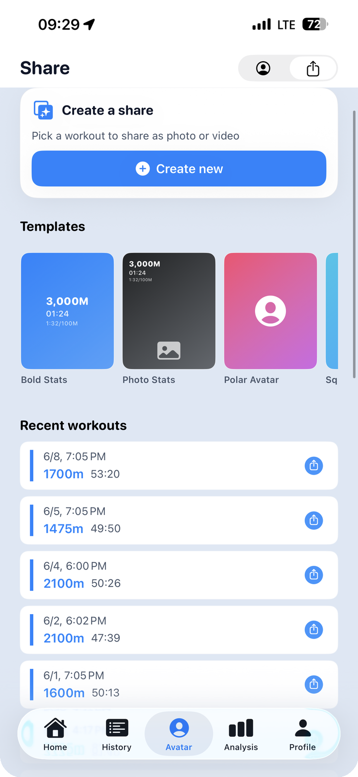
To get started, open the "Create a share" screen. The top half shows a template gallery; the bottom half lists your recent sessions. The flow is simple: pick a session, pick a template, then go in and customize.
Four templates are available.
| Template | Character |
|---|---|
| Bold Stats | Large, heavy numerals front and center. Clean and assertive. |
| Photo Stats | Stats overlay on your background photo with a semi-transparent layer. The location feels present. |
| Polar Avatar | Your avatar anchors the center, stats arranged around it. Has a game-card quality. |
| Square Stats | Square layout. Built for feed posts. |
Which template works best depends on your background photo. Bright outdoor shots tend to read more clearly with Bold Stats or Square Stats. Darker pool photos or anything with soft light handle the translucent overlay in Photo Stats well.
Sessions are listed in reverse chronological order, so the most recent workout is right at the top.
3. Overlaying Stats on a Photo — Choosing What to Show
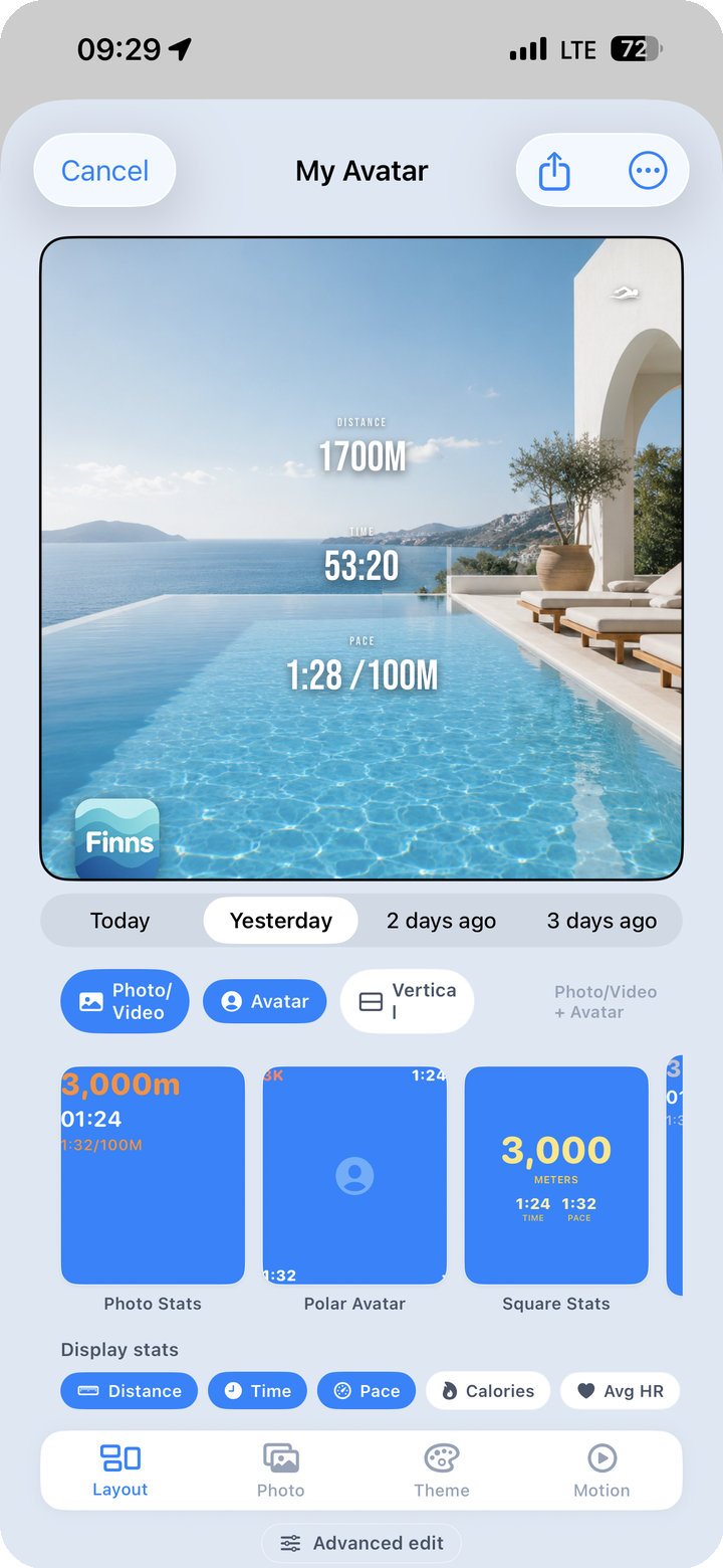
Once you have a session and a template, the edit screen opens. Two things matter here: what goes in the background, and which numbers appear on the card.
Background: Photo, Video, or Avatar
Tabs along the top let you switch between sessions — today, yesterday, the day before — without going back to the previous screen. For the background itself, you pick one of three modes.
- Photo / Video — A photo or short video from your camera roll sits behind the stats. A pool photo, a resort terrace, a pre-dawn sky — whatever you shot that day.
- Avatar — Your FINNS avatar takes center stage.
- Vertical — Switches to a portrait-oriented layout.
Display Stats: Turn Numbers On or Off
The "Display Stats" row at the bottom shows your available data points as chips: distance, time, pace, calories, average heart rate. Tap any chip to toggle it on or off, and the card updates in real time.
If you are posting for a general audience, you might surface distance and time and hide SWOLF. If you are comparing notes with swimming friends, bring pace and SWOLF forward. There is no need to fit every number onto one card.
A toolbar at the bottom — layout, photo, theme, motion, advanced — holds deeper editing options for each section.
4. Matching the Card to Your Feed — Colors and Themes
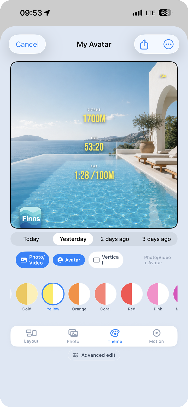
The card's text and overlay tones can be changed by choosing a theme. The palette includes Silver, Gold, Yellow, Orange, Coral, Red, and Pink, among others.
This matters more than it might seem. A consistent aesthetic is part of what makes an Instagram or Threads feed look considered rather than random. If the swim card is blue one week and red the next, the feed looks scattered. Lock in a theme that suits your usual palette and the cards will start to stack into something that looks like an intentional archive.
Silver reads as understated and clean. Gold and Yellow bring warmth and energy. Coral and Red are bold and direct. The right choice depends partly on your background photo and partly on the feel you want to project.
5. An Animated Session Video
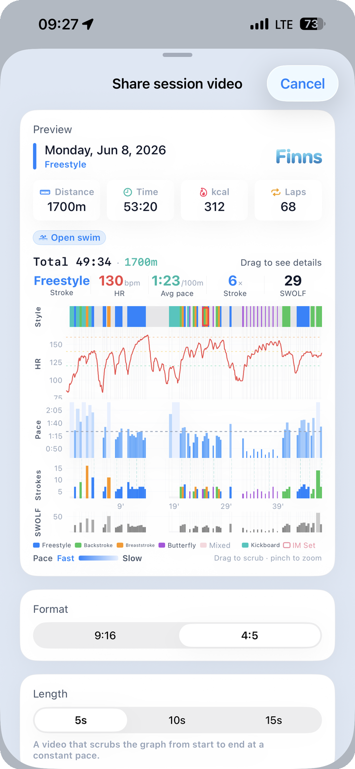
If a still card is not enough, there is an option to export an animated video instead. The feature is called "Share session video."
Two things to configure.
Output format - 9:16 — Full vertical, built for Stories, Reels, and Shorts - 4:5 — Slightly wider vertical, better for feed posts
Video length - 5 seconds, 10 seconds, or 15 seconds
What the video shows is a graph animation: your session data draws itself from the beginning of the swim to the end, left to right, in real time within the chosen clip length. Distance, pace — whatever the card is displaying — builds out across the screen as the video plays. It is a different way of communicating a session compared to a static screenshot. A viewer watching for five seconds can follow the arc of the workout.
The exported video saves to your camera roll or goes straight to a share sheet for Instagram, Threads, or anywhere else.
6. A Full Month in One Card — Monthly Report
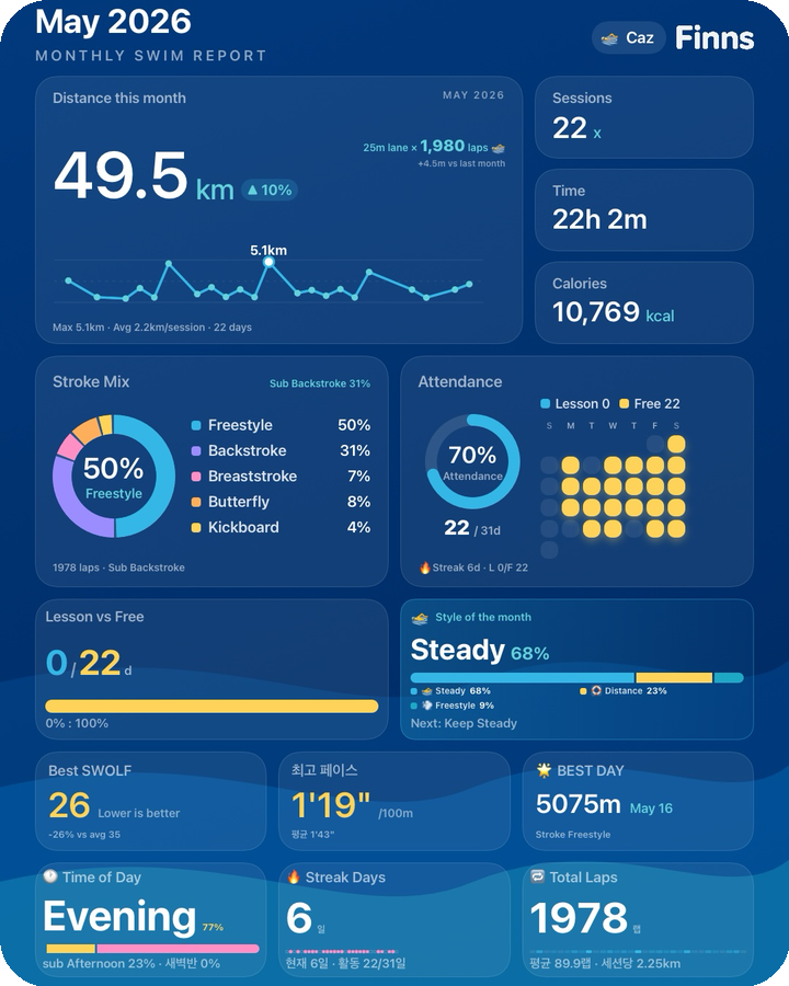
For a longer view than a single session, the monthly report card wraps up everything from the past month in one exportable image.
Here is what fits on it.
- Total distance — cumulative kilometers for the month
- Stroke ratio — freestyle, backstroke, breaststroke, and butterfly as a donut chart
- Attendance rate — sessions completed against your target
- Lesson vs. free swim — the split between the two
- This month's swim personality — the AI-assigned type for your recent behavior (endurance, sprinter, technician, and so on)
- Best SWOLF · Best pace · BEST DAY — the highlights of the month
- Time-of-day distribution — when you tend to swim: dawn, morning, midday, afternoon, evening
- Longest streak — the maximum consecutive swim days
- Total laps — all laps completed in the month
All of that lands on a single card. A "Save as photo" and a "Share" button sit at the bottom.
At the end of a month this card serves as a natural checkpoint. How much ground did you cover? What stroke dominated? When did you usually get in the water? Saving it each month builds a visual log that does not depend on scrolling back through the app.
7. A Weekly Recap — Weekly Report
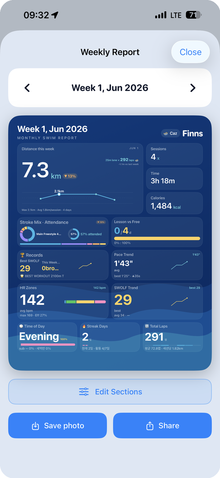
The weekly report card does the same job as the monthly version, scaled down to one week. It summarizes the past seven days in a single card.
One extra option here: Edit Sections. You can choose which sections appear on the weekly card before saving. Some weeks there is a lot to show; other weeks you want to highlight one thing. Decide on the layout, then save to your photo library or share directly.
Some swimmers use this as a weekly ritual — generate the card on Sunday, save it, maybe post it. Over time the cards pile up into a visual diary, and the numbers carry context that numbers alone cannot: "that week was light because I was traveling," or "that week I finally broke my pace record."
8. Sharing as Part of the Habit
Recording a swim and sharing it are two different acts. Recording preserves the data. Sharing adds meaning to it.
The few minutes spent putting together a card after a session are also a moment of reflection. What kind of swim was it? What went well? What would you do differently? That small loop — finish, reflect, share — has a way of feeding into the next session.
Whether you post it publicly or just save it for yourself, a record that looks worth keeping tends to be one you actually come back to.
More from this series:
- For the medal system and avatar progression: Post 04 — 240 Medals and the Evolving Avatar
- For the gamification and motivation design: Post 04 — 240 Medals and Evolving Avatar