Most swim apps hand you a stack of averages after the session ends. Average pace, average heart rate, total distance. Useful, but flat. They tell you what happened on average, not what happened in the moments that actually shaped the swim.
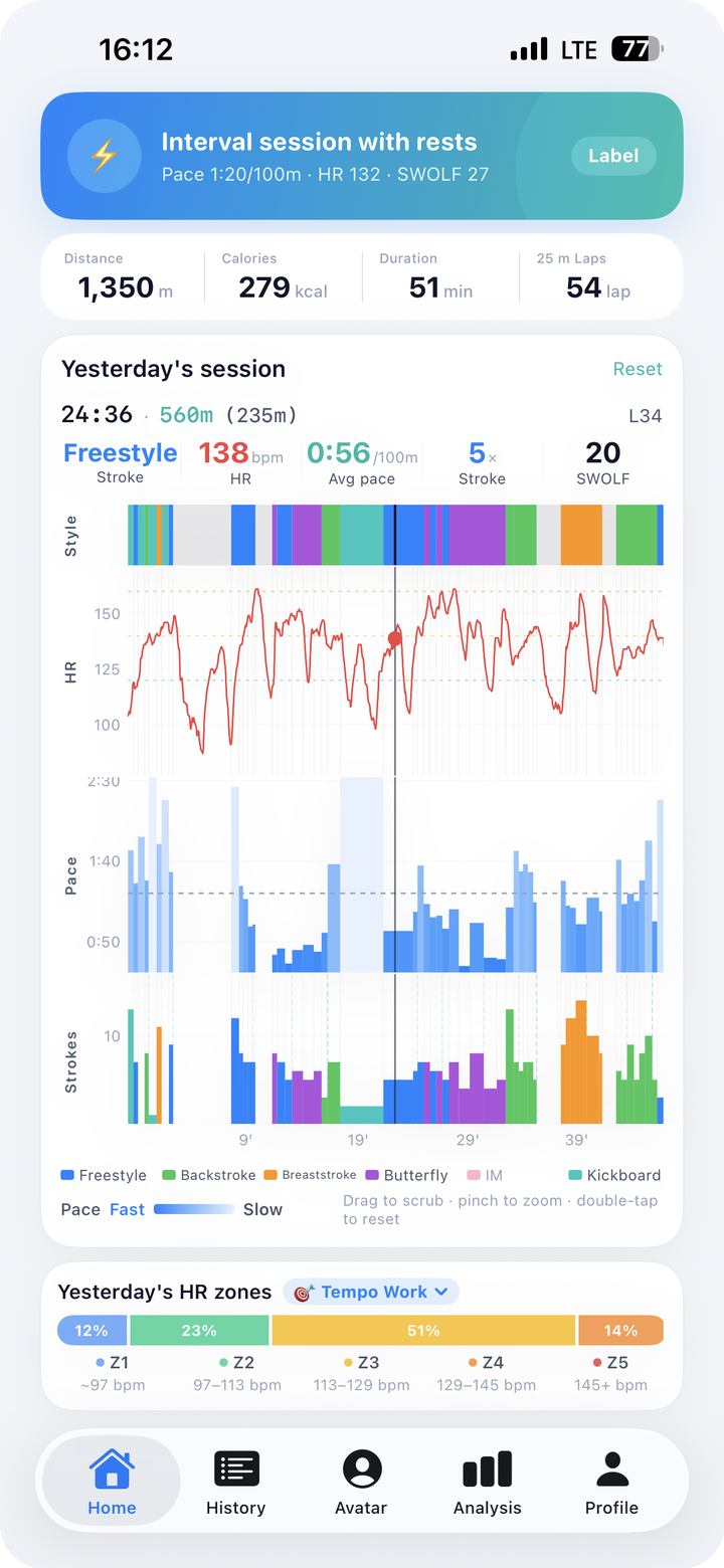
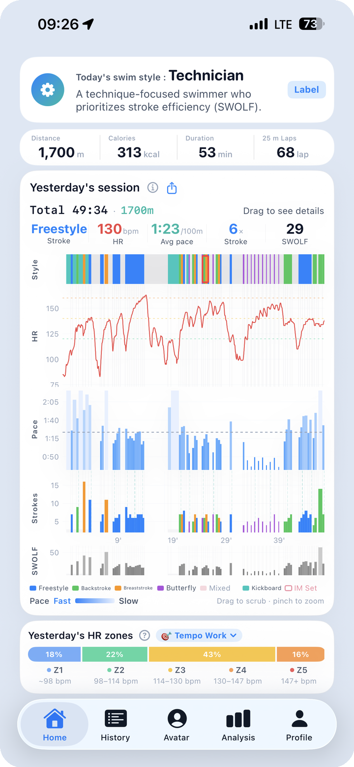
Finns SwimLog's signature screen takes the opposite approach. Five data streams — stroke style, heart rate, pace, strokes, and SWOLF — share the same time axis, stacked vertically. When you look at one moment, you see all five at once. Once you know how to read it, a full session fits in your head in about 15 seconds.
This post is the reading manual.
What the 5-Channel Multi-Chart Actually Is
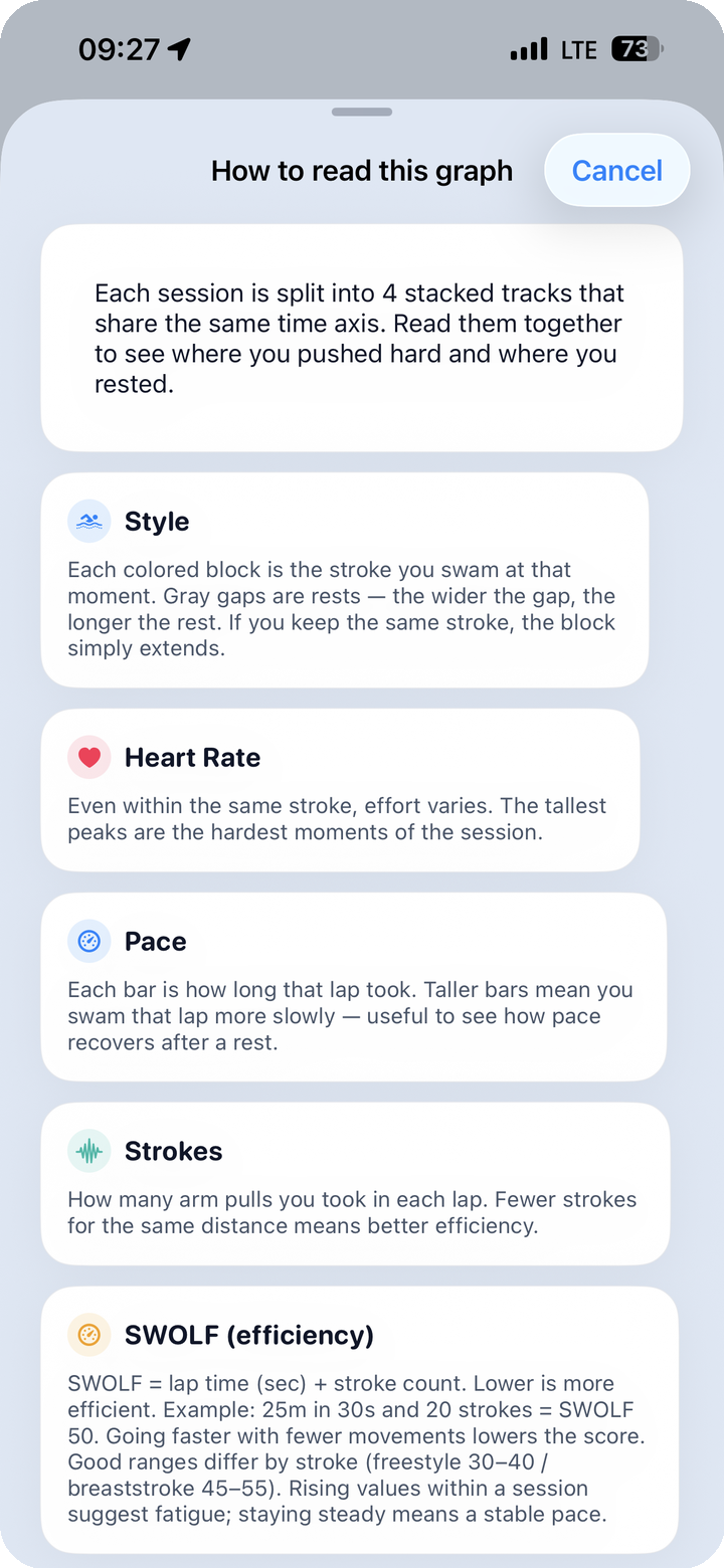
Open any session in the app and you'll see five panels lined up vertically, all driven by the same horizontal time axis:
| Channel | What it shows | Visual form |
|---|---|---|
| Style | Which stroke you were swimming at each moment | Color-coded bands across the timeline |
| HR | Heart rate over time with Z1–Z5 coloring | Continuous curve, zone-tinted |
| Pace | Pace converted to seconds per 100m | Line graph (lower = faster) |
| Strokes | Per-lap stroke count | Vertical bars, one per lap |
| SWOLF | Per-lap stroke efficiency (stroke count + lap seconds) | Vertical bars, one per lap |
Strokes and SWOLF are distinct channels, not the same thing. Strokes tells you how many arm cycles it took to cross the pool; SWOLF combines that count with your lap time into a single efficiency score. When strokes rise but SWOLF stays flat, your tempo is up but your glide is holding — a different story from when both rise together.
The shared time axis is the entire point. Drop your eyes from the top channel to the bottom and you're not reading five separate charts — you're reading five perspectives on the same instant.
If your pace sagged at the 18-minute mark, you can look up and see what stroke you were in, check whether your heart rate had already spiked, and look down at Strokes and SWOLF to see whether your efficiency on that lap was drifting. The "why" lives in those relationships, not in any single channel by itself.
The 3-Step Reading Method
The first time you see the multi-chart it looks dense. The second time it looks tractable. By the fifth session you'll be reading it the same way you read a clock face — at a glance, with a clear order of operations.
That order is three steps. Always the same three.
Step 1. Overall Shape — "What kind of session was today?"
Before you zoom in anywhere, look at the shape of the HR curve end to end. The shape tells you the character of the session at a glance.
| HR curve shape | What it means | Session type |
|---|---|---|
| Plateau (flat-ish band) | Steady effort held throughout | Endurance / aerobic base |
| Peaks with valleys | Repeated work-and-recovery cycles | Interval session |
| Staircase (rising steps) | Gradual ramp from easy to hard | Build set or class main set |
A plateau session at Z2–Z3 with a clean horizontal HR line tells you it was a recovery-paced distance swim. A row of sharp peaks above Z4 with deep dips between them is an interval workout, no matter what you intended when you got in the water.
Read your own pattern over a few weeks and you'll start to see your coach's structure in the data. The intent behind a class menu becomes visible without anyone explaining it.
Step 2. Stroke Transitions — "Which stroke is the weak link?"
Now narrow your focus to the stroke channel and the points where the color changes. Stroke transitions are where information leaks out.
- Freestyle → breaststroke, HR drops: breaststroke is functioning as active recovery. Normal.
- Freestyle → breaststroke, HR stays high: breaststroke form is heavy and costing you the same energy as freestyle. Worth working on.
- Stroke band breaks up into fragments: the watch is failing to detect the stroke consistently — usually a sign of long glides off the wall or unusual stroke timing.
This is where the multi-chart earns the most return per minute of attention. A single weak transition, repeated session after session, points directly at a technique problem you can name. Without the time-aligned view, that pattern stays invisible because the averages absorb it.
Step 3. HR-Pace Decoupling — "Where did the cost go up?"
Now compare the pace channel and the HR channel side by side, especially in the second half of the session. Three patterns matter.
| Late-session pattern | What it indicates | Action |
|---|---|---|
| Pace holds, HR climbs | Same speed is costing more now — fatigue is accumulating | Pacing was slightly too aggressive |
| Pace drops, HR holds | You consciously eased back — controlled recovery | Intentional; no action needed |
| Both improve late | Warm-up wasn't long enough — you finally hit rhythm | Extend the warm-up next time |
"Decoupling" is a real concept from endurance training: when one variable holds steady but the other moves, the gap between them tells you something specific about your physiology in that session. In swimming, it's the difference between "I was tired" and "I started fatigued from lap 1" — and that difference changes how you should structure next week.
Three steps. Overall shape, stroke transitions, decoupling. Run them in order and most sessions resolve into a clear summary in well under a minute.
The Scrubber — Every Channel, One Moment
The three-step method gives you the macro story. The scrubber gives you the micro one.
Press and hold anywhere on the chart area and drag left or right. A vertical line moves across all five panels simultaneously, and the header shows the exact values at the scrubber's position:
Time:    24:12
Style:   Freestyle
HR:      158 bpm (Z3)
Pace:    1:48 / 100m
Strokes: 18
SWOLF:   38
Five values, one moment, one screen. The question "what was going on right here?" becomes a literal drag-and-read.
The scrubber is especially useful for comparing two moments in the same session. Drag to one timestamp, note all five values. Drag to a later timestamp covering the same kind of effort. The differences explain why one segment felt harder than the other — usually in concrete numbers, not vague impressions.
Galaxy Watch note: FINNS for Android v2.0 (versionCode 25) shipped a multi-chart readability pass. The time and HR text stay sharp even during fast scrubs, so you can drag at any speed without losing the values in motion blur.
The Rest Timeline — Idle Time Is Data Too
Between sets, at the wall, mid-swim water break — most watches just write those moments off as "not swimming." They disappear from the chart.
Finns SwimLog handles rest differently. Rest segments are rendered as a distinct band so you can see when you stopped and for how long. Three patterns are worth recognizing.
| Rest distribution | What it suggests |
|---|---|
| Evenly spaced | Interval set with structured recovery — coached pattern |
| Concentrated late | Fatigue forced more rest in the back half — pacing was off |
| Concentrated early | Warm-up effectively became the main set — review the structure |
Reading your rest pattern next to your pace and HR is how you tell the difference between "I trained intervals today" and "I tried to train intervals but my body switched plans on me halfway through."
One-Sentence Session Summary
If you'd rather not derive your own conclusion every time, every session in Finns SwimLog ends with a one-sentence AI summary. Examples of what the engine produces:
- "Z2-dominant recovery session. Freestyle average SWOLF 36 — better than your baseline."
- "Well-executed interval session. Z5 reached 3 times; recovery between intervals was solid."
- "Class main set: breaststroke SWOLF ran 4 higher than your average — form check recommended."
The summary draws on twelve swimmer-type signatures and your accumulated history. A future post covers that engine in detail; for now, the takeaway is that the chart and the sentence are designed to back each other up. You can read the multi-chart yourself, or skim the sentence, or do both.
Common Questions
The five channels feel cramped on a phone screen — can I simplify the view? Yes. Each channel can be collapsed independently. Many users keep only HR and pace expanded for daily review, and expand the stroke style, Strokes, and SWOLF channels when they want a closer look.
What if the watch misidentified a stroke in part of the session? You can edit the stroke label at the session level. Per-lap stroke editing is on the roadmap for v1.15 and being evaluated based on usage data.
Can I save the multi-chart as an image? The full 5-channel view exports as a 9:16 portrait image (1080×1920), sized for Instagram Stories and Reels or for sharing in messaging apps. The export is composited on-device — no upload, no server round-trip.
What the Multi-Chart Is Really For
Numbers in isolation make you feel something — fast or slow, hard or easy — but they rarely teach you anything new. Numbers in relationship to each other across time are different. They show you the moments your session turned, the strokes that cost you more than you thought, the weeks when your warm-up has been quietly too short.
Three steps to read it. One scrubber for the close-ups. One sentence at the end if you want a shortcut. The rest is just paying attention to what your own swimming has been saying all along.
One swim today, a lifetime of data.